NCERT Solutions For Class 8 Math Chapter – 15 Introduction to graph Exercise – 15.1
Q1. The following graph shows the temperature of a patient in a hospital, recorded every hour.
- What was the patient’s temperature at 1 p.m. ?
- When was the patient’s temperature 38.5oC ?
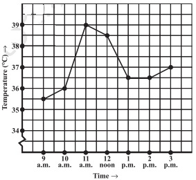
( c ) The patient’s temperature was the same two times during the period given.
What were these two times ?
( d ) What was the temperature at 1:30 p.m. ? How did you arrive at your answer ?
( e ) During which period did the patient’s temperature show an upward trend ?
Solution:-
- The patient’s temperature was 36.5oC at 1 p.m.
- The patient’s temperature was 38.5oC at 12 noon.
- The patient’s temperature was same at 1 p.m. and 2 p.m.
- The temperature at 1:30 p.m. is 36.5o
The point between 1 p.m. and 2 p.m. , x – axis is equidistant from the two points showing 1 p.m. and 2 p.m. So it represents 1:30 p.m. similarly the point on y – axis, between 36o C and 37o C will Represent 36.5 o C.
( e) The patient’s temperature showed an upward trend from 9 a.m. to 11 a.m. and from 2 p.m. to 3 p.m.
Q2. The following line graph shows the yearly sales figure for a manufacturing company.
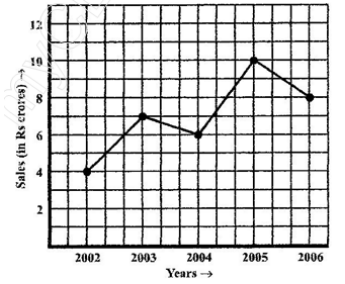
- What were the sales in (i) 2002 (ii) 2006 ?
- What were the sales in (i) 2003 (ii) 2005 ?
- Compute the difference between the sales in 2002 and 2006.
- In which year was there the greatest difference between the sales as compared to its previous year ?
Solution:-
- The sales in:
- 2002 was Rs 4 crores and (ii) 2006 was Rs 8 crores
- The sales in:
- 2003 was Rs 7 crores and (ii) 2005 was Rs 10 crores.
( c ) The difference of sales in 2002 and 2006 = Rs 8 crores – Rs 4 crores = Rs 4 crores
( d ) In the year 2005, there was the greatest difference between the sales and compared to its previous year , which is (Rs 10 crore – Rs 6 crores ) = Rs 4 crores.
Q3. For an experiment in Botany, two different plants, Plant A and Plant B were grown under similar laboratory conditions. Their heights were measured at the end if each week for 3 weeks. The results are shown by the following graph.
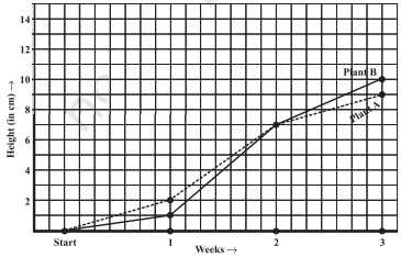
- How high was Plant A after (I) 2 weeks (ii) 3 weeks?
- How high was Plant B after (i) 2 weeks (ii) 3 weeks ?
- How much did Plant A grow during the 3rd week ?
- How much did Plant B grow from the end of the 2ndweek to the end of 3rd week ?
- During which week did Plant A grow most?
- During which week did Plant B grow most?
- Were the two plants of the same height during any week shown here? Specify.
Solution:-
(a)
(i)
The plant A was 7 cm high after 2 weeks
- After 3 weeks it was 9 cm high
(b)
(i)
Plant B was also 7 cm high after 2 weeks
(ii)
After 3 weeks it was 10 cm high
( c ) Plant A grew = 9 cm – 7 cm = 2 cm during 3rd week
( d) Plant B grew during end of the 2nd week to the end of the 3rd week = 10 cm – 7 cm = 3 cm
( e) Plant A grew the highest during second week.
( f ) Plant B grew the least during first week.
( g) Yes. At the end of the second week plant A and B were of the same height, which is 7 cm.
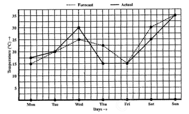
Q4. The following graph shows the temperature forecast and the actual temperature for each day of a week.
- On which days was the forecast temperature the same as the actual temperature ?
- What was the maximum forecast temperature during the week ?
- What was the minimum actual temperature during the week ?
- On which day did the actual temperature differ the most from the forecast temperature ?
Solution:-
- On Tuesday, Friday and Sunday , the forecast temperature was same as the actual.
- The maximum forecast temperature was 350
- The minimum actual temperature was 150
- The actual temperature differed the most from the forecast temperature on Thursday.
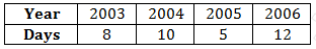
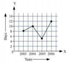
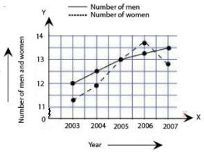
Q5. Use the tables below to draw linear graphs
- The number of days a hill side city received snow in different years.
- Population ( in thousands) of men and women in a village in different years.
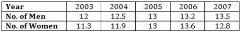
Solution
- Consider “Years” along x- axis and “Days” along y – axis Using given information , linear graph will look like:
- Consider “Years” along x- axis and “No. Of Men and No of women” along y – axis (2 graphs). Using given information , linear graph will look like:
Q6. A Courier – person cycles from a town to a neighbouring suburban area to a deliver a parcel to a merchant. His distances from the town at different time is shown by the following graph.
- What is the scale taken for the time axis ?
- How much time did the person take for the travel?
- How far is the place of the merchant from the town?
- Did the person stop on his way ? Explain.
- During which period did he ride fastest?
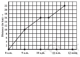
Solution:-
- 4 units = 1 hour
- The person took 3 1/2 hours for the travel.
- It was 22 km far from the town.
- Yes, this has been indicated by the horizontal part of the graph. He stayed from 10 A.M. to 10:30 A.M.
- He rides the fastest between 8 A.M. and 9 A.M.
Q7. Can there be a time – temperature graph as follows ? Justify your answer.
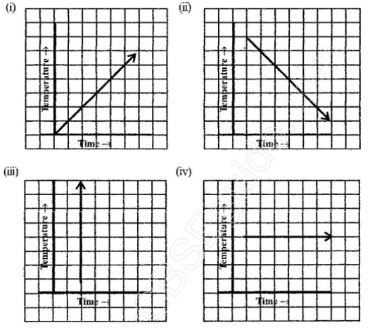
Solution:-
( i ) It is time – temperature graph. It is showing the increases in temperature as time increases .
( ii ) It is a tine – temperature graph. It is showing the decreases in temperature as time increases.
( iii ) The graph figure (iii) is not possible since temperature is increasing very rapidly . which isnot possible.
( iv) It is a time – temperature graph. It is showing constant temperature.
NCERT Solutions For Class 8 Science Chapter – 9
NCERT Solutions For Class 8 Maths Chapter